Christmas Color Palettes for Cards, Scrapbooks and Gift Tags
Christmas color palettes are easier to choose when you can picture them on a card, a gift tag or a scrapbook page. A little cranberry beside evergreen feels different from blush beside sage, even when the paper shapes stay simple.
Here are twelve original combinations with HEX codes, illustrated project ideas and a practical way to use each one. Start with the colors you already own, then add just one missing accent. The free printable palette cards below give you space to note which paper and ribbon match your choice.
Quick answer: choose one main color, one light neutral and a small accent. Use the main shade for the card or page, the neutral behind writing or photographs, and the accent for a tag, ornament or short border. The other colors in each palette are optional helpers, not five colors you must use equally.
Choose the look you want
- Traditional: Evergreen and Cranberry, Burgundy and Champagne, Midnight Navy and Gold, or Cranberry and Kraft.
- Soft and wintery: Icy Blue and Silver, Sage and Cream, Blush Pink and Sage, or Pink and Rose Gold.
- A little different: Teal and Copper, Gingerbread and Cream, Retro Mint and Red, or Lilac and Midnight Blue.
Keep the palettes beside your paper
Download all twelve reference cards in the paper size you use. Each PDF has two pages with six cards per page, color names, HEX values and room for your own paper and ribbon notes.
How to choose Christmas colors for your project
Begin with the thing you want people to notice. On an album page, that is usually the photograph. On a greeting card, it might be one paper star or a short message. Pick a color from that focal point and let the rest of the palette support it.
- For photographs: repeat one color from a coat, ornament or background detail. Give the photo a plain light mat if the patterned paper is busy.
- For cards and tags: keep the message area calm. Use the strongest color for the main decoration and repeat it once in a smaller detail.
- For a whole journal: choose one neutral and two main shades to repeat. Let ribbons, tabs and pockets carry the accent from page to page.
You can use fewer colors than a palette shows. Try laying three paper scraps together before cutting anything: the background, the focal color and one accent. If they work at that small scale, use the same relationship on the finished project.
Classic Christmas colors
These combinations use familiar Christmas colors with enough light paper to keep the finished project clear. Choose one when you want a coordinated set of cards, envelopes and gifts.
1. Evergreen and Cranberry
Deep green gives this traditional Christmas color palette its structure, while cranberry makes one detail stand out. Ivory keeps a busy design from feeling crowded. The softer sage is useful when a full-strength red-and-green combination feels too sharp.

Ivory
#F7F0E3
Forest
#214C3A
Cranberry
#A92F3C
Sage
#8FA88A
Warm gold
#C3A05C
Try this: Layer a botanical paper border over a forest-green card, leaving an ivory center. Add a cranberry honeycomb ornament, a sage sprig and a thin gold mat. Repeat the foliage and ornament on a matching gift tag.
For a scrapbook page, use ivory behind the photograph and keep strong red away from faces. One red caption tab is usually enough.
2. Burgundy and Champagne
Burgundy gives a holiday project depth without the brightness of cherry red. Champagne and warm ivory soften it, while a little muted green keeps the result connected to the season. This is an easy palette for a coordinated batch of cards and gift folders.

Ivory
#F5EBDD
Burgundy
#6E2337
Bronze
#B5906F
Champagne
#D9C6A5
Deep green
#3D5144
Try this: Build a burgundy gatefold folio with an ivory center panel. Layer a champagne botanical border and a paper rosette inside the center, keeping both folds clear. Add a slim ribbon band and a matching tag.
Choose one warm metallic finish. Mixing bright silver with champagne and bronze can make the small details compete.
3. Midnight Navy and Gold
Navy makes pale paper and small gold details look especially clear. The slate blue bridges the contrast between the darkest and lightest colors, so the finished project feels layered rather than stark. Try it with stars, snowy silhouettes or evening photographs.

Ivory
#F7F1E3
Navy
#1D304B
Pale grey
#D9DEE4
Gold
#C0A061
Slate blue
#7C92AB
Try this: Cut nested star windows into navy, ivory and gold paper layers, then separate the layers with thin foam pads. Add a folded gold star at the center and repeat one star on a matching navy tag.
Gold-colored ink prints as a flat color. Use foil cardstock, metallic thread or a real ribbon when you want physical shine.
4. Cranberry and Kraft
Kraft brown is a useful neutral for Christmas wrapping because it gives patterned paper and red accents something calm to sit against. Cranberry adds the festive note; pine green and cocoa keep the palette warm and grounded.

Ivory
#F6F1E8
Kraft
#B58F68
Cranberry
#A33B45
Pine
#405948
Cocoa
#71513D
Try this: Pair pine-and-berry kraft paper with a plain cranberry belly band. Layer an ivory tag over kraft, add a dark green paper sprig and finish with cocoa cord. Use a narrow gingham band on a smaller matching gift.
Use a white or ivory label for handwriting. A light text panel is easier to read than writing directly on a dark red band.

What’s inside these 12 Christmas palettes
Twelve ready-made Christmas palettes, so you never have to guess again — pick one before you cut a single sheet.
- Traditional: evergreen and cranberry, or burgundy.
- Soft and wintery: icy blue, sage, blush and gold.
- Playful: teal and copper, gingerbread, retro mint.
Each palette lists its HEX codes and a small project idea.
Soft and wintery Christmas colors
Pale blues, sage and soft pink make room for snowy photographs, botanical paper details and lighter holiday projects. A darker accent gives the gentle colors definition.
5. Icy Blue and Silver
This cool Christmas palette suits snowy photographs and simple white paper shapes. Ice blue supplies the color, silver grey adds a quiet second layer, and a little deep blue gives captions or frames enough definition.

Snow
#FAFAF7
Ice blue
#B7D6E5
Blue grey
#6B8C9E
Silver grey
#D6DCE0
Deep blue
#334E66
Try this: Mat one winter photo in white and place it on an icy-blue page. Build a cluster with patterned strips, vellum and layered snowflakes, then add a silver-grey journaling label. Keep every layer inside the page margins.
If your photo already contains a lot of blue, make the largest background area white and use ice blue as the mat instead.
6. Sage and Cream
Sage and cream make a gentle Christmas combination when you want greenery to be the main decoration. Fir green adds definition, oat brings a paper-like warmth, and a small soft-gold detail gives the project a festive finish.

Cream
#F5F1E7
Sage
#9EAE97
Fir
#405E4E
Oat
#D9CFB9
Soft gold
#B59A68
Try this: Make a sage botanical-paper pocket with an oat backing and a stitched edge. Add a layered cream poinsettia to the front. Tuck in a cream tag decorated with a dark fir wreath and a few small gold berries.
Repeat one botanical shape rather than several unrelated flowers. The limited motif keeps a soft palette from looking fussy.
7. Blush Pink and Sage
Blush pink feels seasonal when it sits beside leafy sage and a deeper fir green. Ivory prevents the colors from becoming too sweet, and dusty rose gives small paper details enough contrast. It works well for floral holiday cards and a softer style of gift wrapping.

Ivory
#FFF6EE
Blush
#E7BCC2
Sage
#9EAD97
Rose
#B97983
Fir
#445D50
Try this: Layer blush botanical paper over a dusty-rose mat and an ivory card. Cluster shaped paper poinsettias with sage leaves and dark fir sprigs along one corner. Repeat a smaller cluster on two long gift tags.
For a family album, let pink and sage frame the photo rather than tinting the whole page. A plain ivory photo mat helps the picture stay central.
8. Pink and Rose Gold
Rose gold warms pink and gives it a slightly different feel from a cool pastel palette. Cream is the useful breathing space between the two. A little taupe is enough for shadows, captions or a quiet border.
Cream
#FBF0E9
Pink
#E7B3C2
Dusty rose
#C58391
Rose gold
#B87C64
Taupe
#9A8175
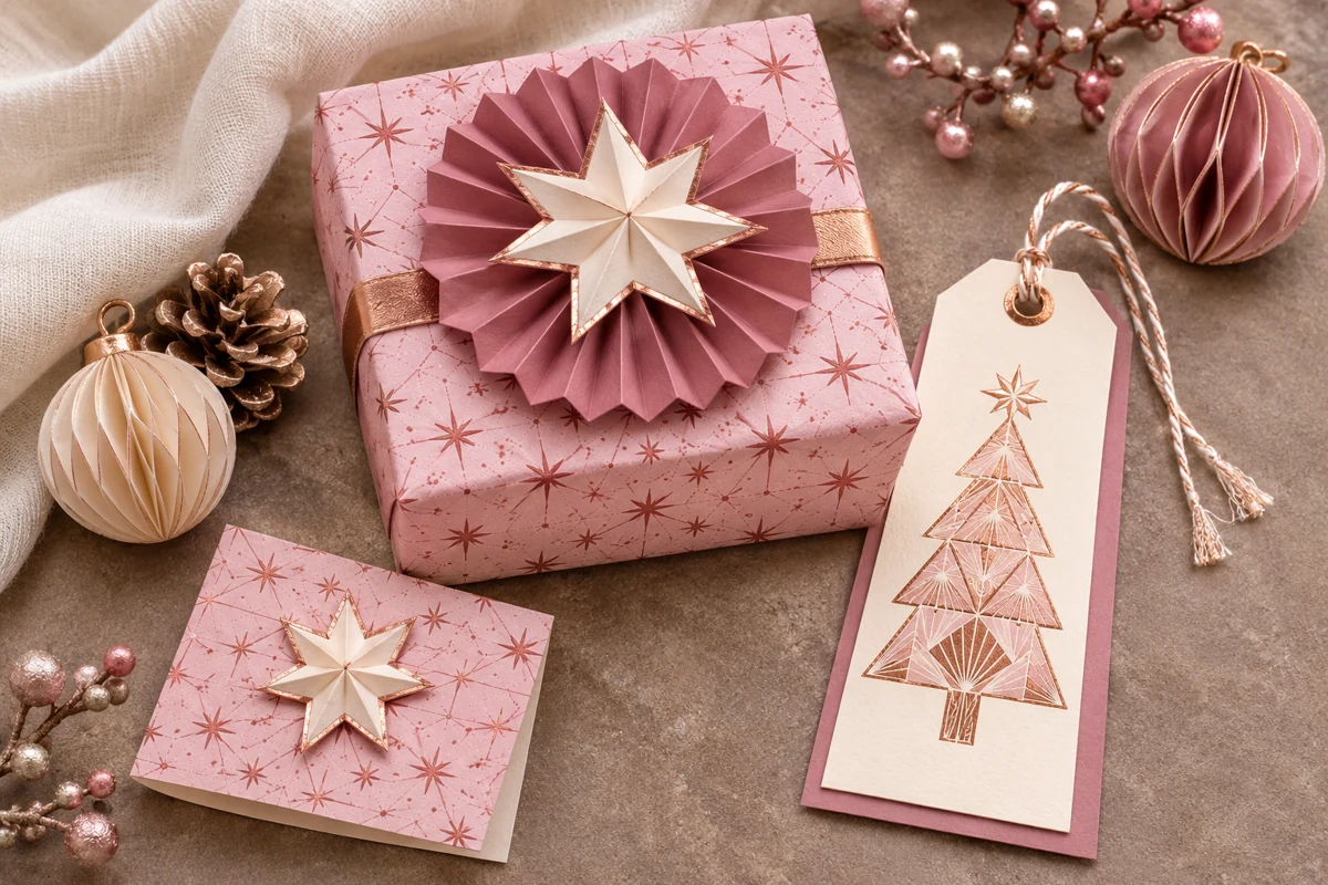
Try this: Wrap a small box in pink star-patterned paper and add a narrow rose-gold band. Fold a dusty-rose fan rosette for the lid, then top it with a cream star. Make a long cream tag with a geometric tree detail.
Keep the metallic-looking accent narrow. A large copper-colored background can overwhelm the delicate pinks.

Test a palette on small tags first
A handful of tags is the cheapest way to find out whether a colour combination works before a whole page depends on it.
- Kraft, cream or white tags as the quiet base colour.
- One patterned paper cut into tags beside plain ones.
- Ribbon, string or a sprig of greenery to tie the set together.
Playful and unexpected Christmas colors
A Christmas project can feel festive through its shapes and story as well as its colors. Stars, little paper ornaments and baking details help these less traditional combinations feel seasonal.
9. Teal and Copper
Teal gives a holiday project a rich base, and copper adds warmth beside it. Seafoam is the lighter color that keeps the pair from feeling heavy. It is a useful alternative for people who enjoy Christmas projects with simple geometric decorations.

Cream
#F8F0E2
Teal
#246B68
Seafoam
#A7C8BD
Copper
#B87350
Deep teal
#294B46
Try this: Layer teal star-patterned paper over a seafoam mat and cream card. Arrange one large folded copper star with two smaller stars diagonally across the front. Repeat a star and a patterned strip on a seafoam gift tag.
Use copper as an accent and keep the deepest teal for a narrow border. Too many dark layers can hide the paper shapes.
10. Gingerbread and Cream
Caramel and cream bring a baking-day feeling to a page without needing lots of extra colors. Cocoa gives the gingerbread shape definition, while warm red separates the layers. Use this palette for recipe keepsakes, kitchen gifts and a December afternoon spent baking.

Cream
#FFF3DF
Caramel
#B77B4B
Cocoa
#6D4637
Warm red
#BA594D
Biscuit
#D8AF80
Try this: Mount a cream recipe panel on a warm-red backing and add a small patterned-paper border. Build a low-relief gingerbread house from cocoa walls, caramel roof layers and cream icing details. Leave the other half of the panel clear for writing.
Give neighboring layers different lightness: a dark house on a cream panel, a red border around the card and a cocoa background. This keeps the shapes clear even in a small preview.
11. Retro Mint and Red
Mint and cherry red make a cheerful Christmas palette with a slightly retro feel. Warm ivory and butter yellow stop the combination from looking too cold. The dark pine color is useful for one small outline or a short handwritten message.

Ivory
#FFF5E8
Mint
#BFDACB
Cherry
#CD454A
Butter
#E4BD75
Pine ink
#3B4B45
Try this: Combine mint paper with cherry-red and butter-yellow baubles in different elongated shapes. Give each ornament one stripe, dot or diamond pattern, then add an ivory mat and a narrow gingham strip. Repeat one bauble on each gift tag.
Keep patterns simple: one stripe, small check or plain paper shape. Several bold patterns can compete with the already lively color contrast.

From a swatch strip to a midnight page
The pin shows what a palette becomes once it leaves the swatch card: gold stars on teal, a warm gingerbread spread, and the frosty lilac night that opens the last palette below.
Cut a strip of each swatch and tape it inside the journal cover — the reference stays with the project.
12. Lilac and Midnight Blue
Lilac gives midnight blue a softer partner than bright white. Pale mist and ivory make room for writing or a photograph, while plum adds a gentle second accent. Try this combination for winter-night scenes, stars and reflective end-of-year pages.

Ivory
#F5F2EF
Lilac
#B8A7CC
Midnight
#2C304F
Mist
#D8D2E1
Plum
#6E577B
Try this: Separate midnight, lilac and ivory paper-cut forest layers with thin foam pads. Add a lilac crescent and small ivory stars, then frame the scene with a plum mat. Echo the moon on a long matching gift tag.
For a scrapbook layout, choose either a dark background with a pale photo mat or a pale background with one dark panel. The contrast works best when one area clearly leads.
Turn a palette into a finished paper project
- A greeting card: one folded card in the main color, one light writing panel and one contrasting decoration. Echo the accent on the envelope or tag.
- A scrapbook page: a calm background, a plain mat around your photo and a small color repeated in two or three places. Our Christmas scrapbook layouts with photos give you page arrangements to start from.
- A journal pocket: keep the pocket and its tag in related shades, then add one dark tab or sprig. Use the Template Maker for an outline that fits your page, or explore our junk journal pocket ideas.
Find paper and details that suit your palette
A palette is a starting point for choosing materials. Browse our Christmas scrapbook paper collection for previews, project ideas and links to the original sets. Look for one or two colors in common rather than expecting every sheet to match all five swatches exactly.
- For cool blues: start with Blue Winter Christmas paper and snowflake digital papers.
- For finishing details: browse Christmas clipart and vintage Christmas stamps for a focal picture, a little label or a decorative stamp. Keep the material you choose in its original proportions.
Print your Christmas palette cards
Choose A4 or Letter below. Print at Actual size or 100% for the intended card layout, then cut along the light outer borders if you want separate cards. You can also keep each page whole and write your paper choices underneath the swatches.
HEX values are a digital reference. The paper, ink and printer settings affect the printed result, so compare one printed page with your real cardstock and ribbon before making a whole batch.
Questions about Christmas color palettes
What colors go well together for Christmas?
Red and green with ivory are a familiar choice. Navy and gold, icy blue and silver grey, sage and cream, and blush with fir green are other useful combinations. Choose the one that works with your photograph, paper or main decoration.
How many colors should I use on one card or page?
Begin with three: a main shade, a neutral and an accent. Add a fourth or fifth only when it helps connect the materials you already have. A plain light writing panel often does more for a page than another patterned paper.
Can I use pink or purple for Christmas crafts?
Yes. Pair pink with fir green or rose-gold-colored details, and lilac with midnight blue and pale stars. Seasonal shapes and a coherent color story can give a project its Christmas feeling without traditional red and green.
Will the printed colors match the HEX codes exactly?
A home printer will not always reproduce the screen color exactly. Treat the codes as a starting point and make a small test print on your chosen paper. Metallic-looking gold and copper swatches print flat; foil, ribbon or metallic cardstock supplies actual shine.
Are the printable palette cards free?
Yes. The A4 and Letter reference-card PDFs linked in this article are free to download from pngdiy.com. Each file contains all twelve palettes across two pages, with space to record your material choices.
Start with one palette and one small project. A card and its matching tag are enough to see which colors you want to repeat across the rest of your Christmas crafting.